Tutorial 02: FUI – X Crosses
This is second part of the FUI tutorial series. You can watch the first one here.
The idea to make this design, came up to me, when I saw this post on Instagram by Motion Graphics Collective. Design was made by Florentzunino. I liked the dots and vintage look to it, and repetitive “pulses”.
For the rest of tutorials in this series, please see the following links:
Overall Set Up
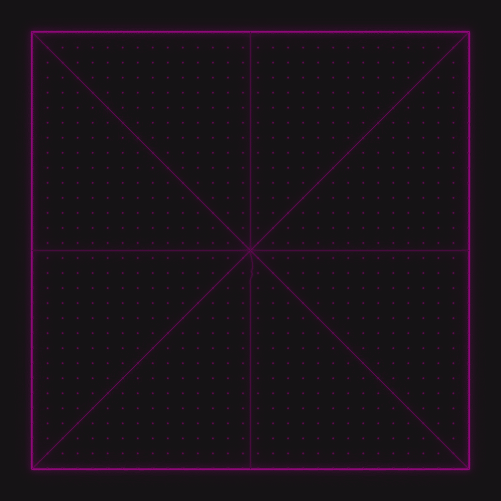
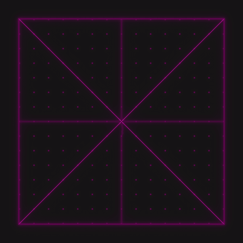
In this tutorial, we will add responsive Cross and X. With few expressions, we can define boundaries, where Cross and X will end. As established already, by using 1 control layer, we can easily modify thickness of those layer, to add different visual style to them.
Height of Cross
Draw a Rectangle, then add this code to shape layer Size property.
It’s pretty simple code – by using various defined variables / slides we added to main Control Null, we can calculate height of the Cross. The part that was the most complex in initial set up was calculating correct distance between all dots. It is done by taking total number of dots and subtracting 1 from it. Then you multiply it by gap size.
We are doing it this way, so we have correct number of “gaps” in our final calculation. Otherwise, our Cross would be a little bit too big.
Since final design is squared box, we need to use Repeater on this Shape Layer and use Rotation function to rotate the generated shape by 90 degrees. This way we will have responsive Cross, that touches sides of the box at all times.
Anchor Point – Center
Position – In the Middle of Composition
I’m reusing the same 2 expressions for Position and Anchor Point as before to keep everything centered in Composition. You will notice, that those 2 Expressions are pretty useful and I use them all the time.
X – Bottom Left Position
X – Top Right Position
X – Top Left Position
X – Bottom Right Position
This section might look like it has a lot of code, but all of it is the same. The only difference is how X and Y is calculated in last lines for each line.
In previous section, we used Shape Layer to generate Cross. This time, because the lines are at an angle, it will be easier to create the final design with Pen Tool and reposition Shape Path Points. Simply draw a line with Pen Tool. Then on Path Property, run script that generates Nulls that Follow Points – it is built in the After Effects in Window drop down.
Then on generated Nulls, add Anchor Point expression from section above. Finally, add the above Position expressions for each Null to push it in right place – Top Left, Bottom Right and so on.
Whole thing is pretty simple – we are grabbing bunch of variables linked up to our main CTRL layer. All the slides that control number of dots, gap between them, size and so on. Then from Composition Center, we are pushing Nulls in appropriate directions.
I’m using Composition Center to do it, as all the layers are using Anchor Point – Center and Position – Center expressions. Simply, we are generating all the graphics from Comp Center at this point.
This project file contains all the assets necessary to make animation in the tutorial in final form. Everything is labeled, linked, with expressions and ready to use, if you wish to make your own version or just play around with it.
If you have any suggestions for tutorials or how I can improve, please do get in touch. I would love to hear from you.


