Tutorial 21: Data Visualization in Cavalry
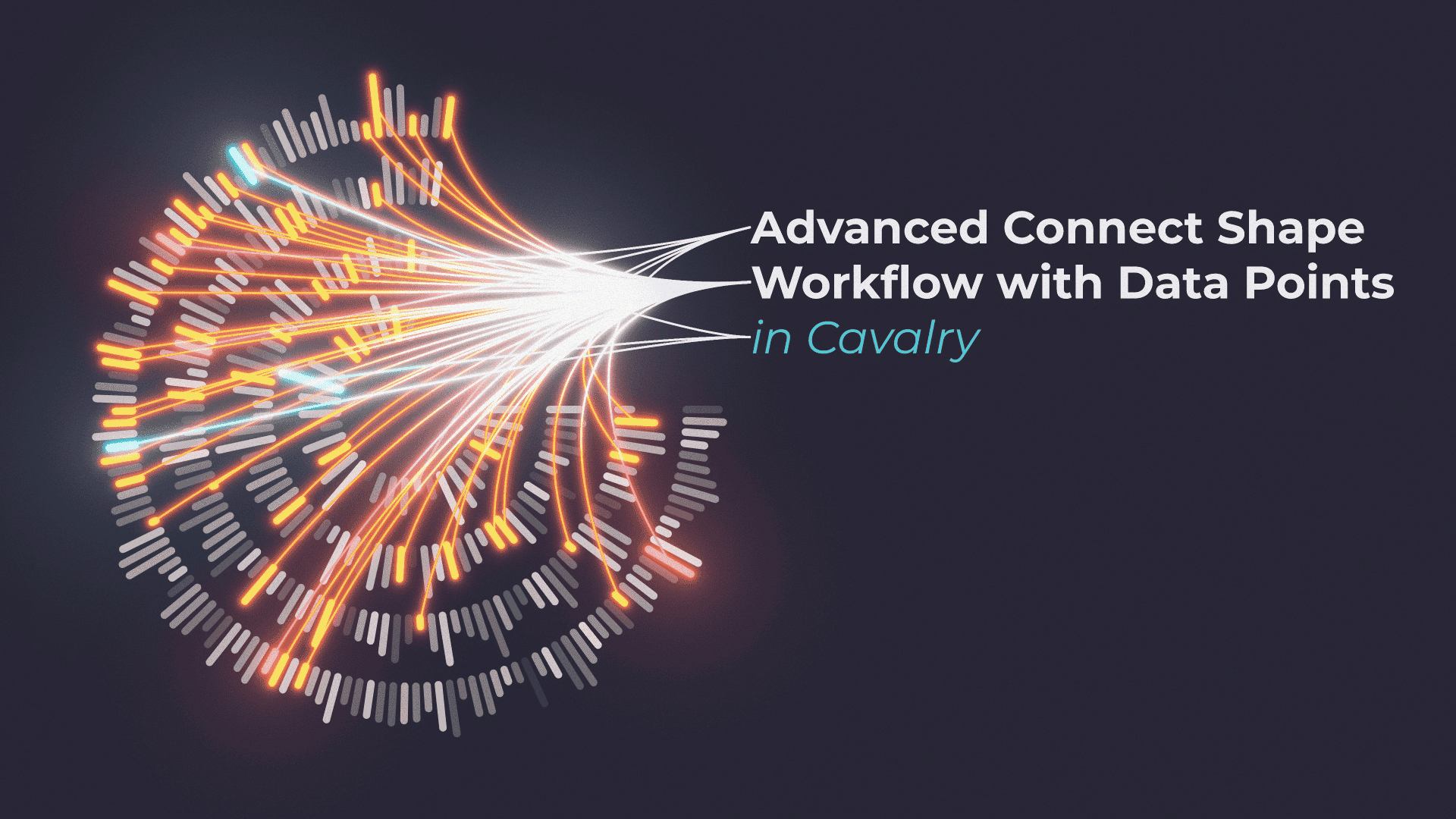
I saw this image on Pinterest and decided to recreate it in Cavalry and animate it at the same time. It was a fun challenge and at the end, the results you can see in the tutorial above. When you are facing with similar problems, the best way to approach it is one part at a time.
- Creating individual data blocks
- Creating data start points
- Connecting data with start points
- Assigning colour information to data, based on data size
- Customising connections
- Animating everything
I have used a number of tools and techniques available in Cavalry, that made it possible to randomise the look of the whole graphic from one place. Here is a list of the tools used:
If you are stuck at any point of the tutorial, check out the links above to official Documentation provided by Cavalry team. Also, make sure to download the project file at the bottom of the page, too.
More examples
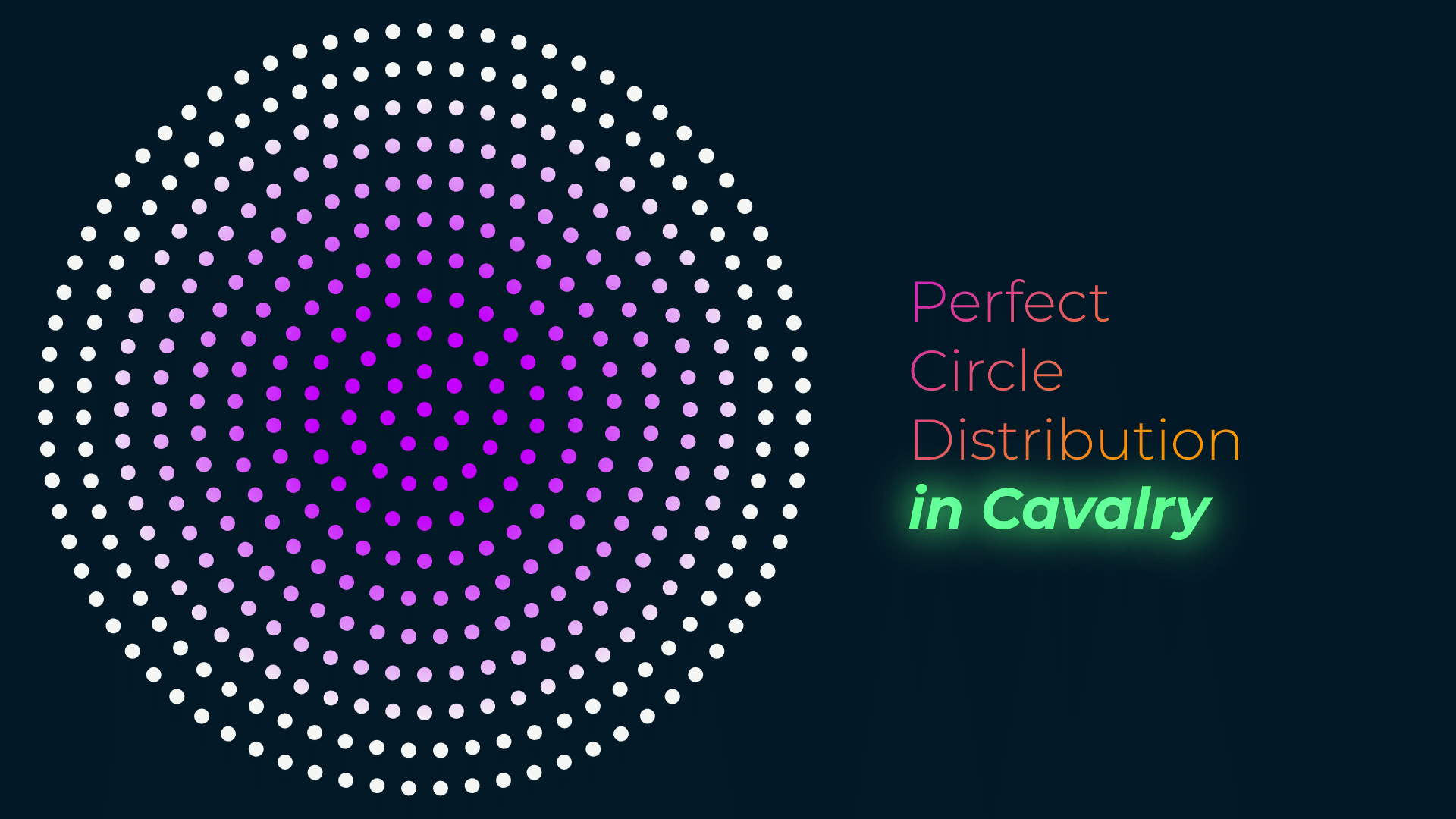
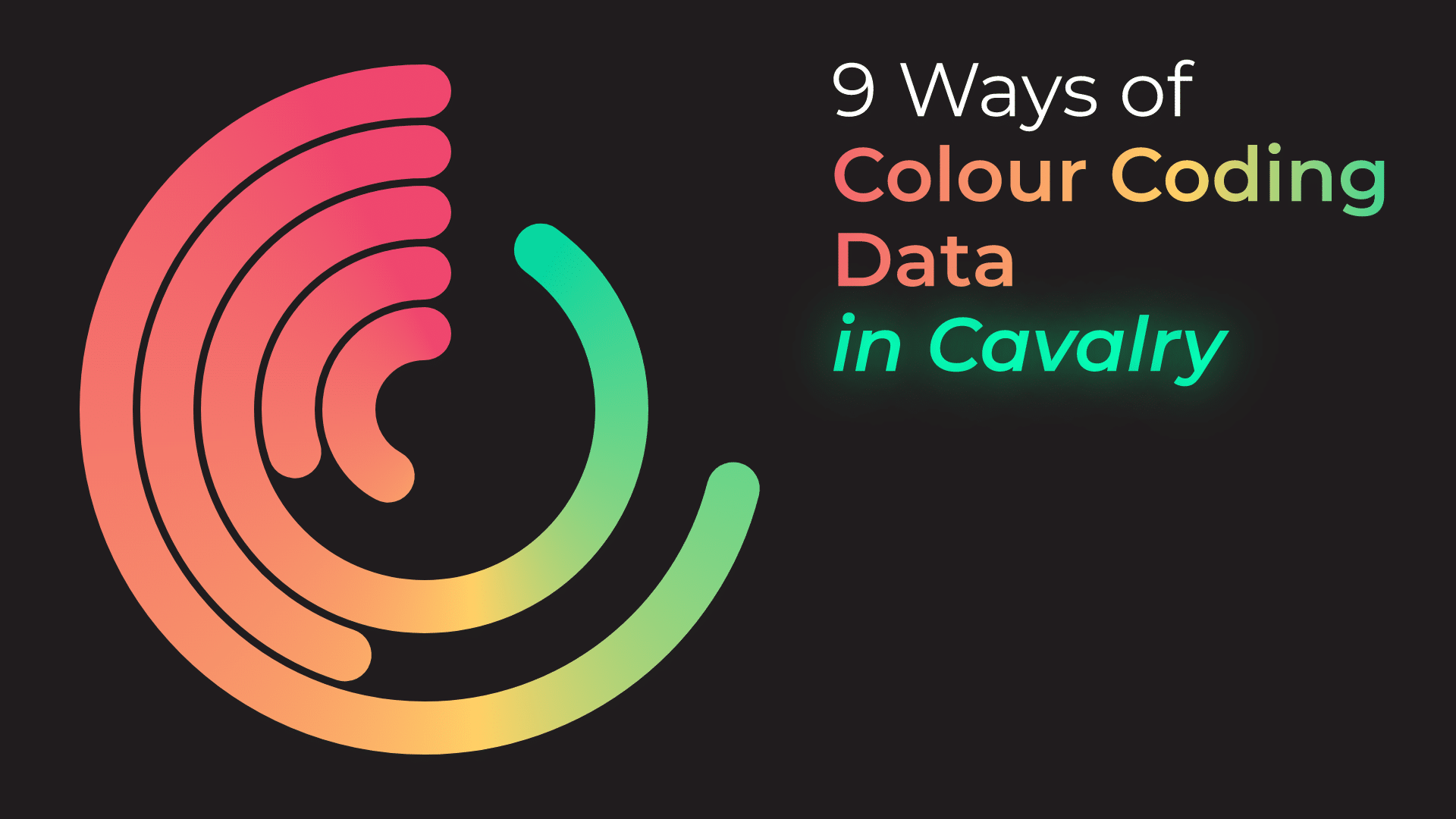
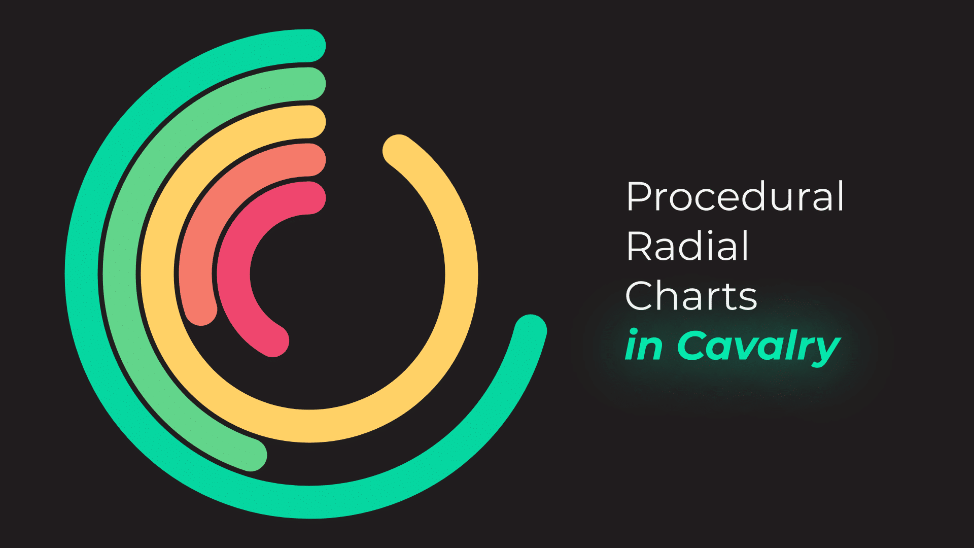
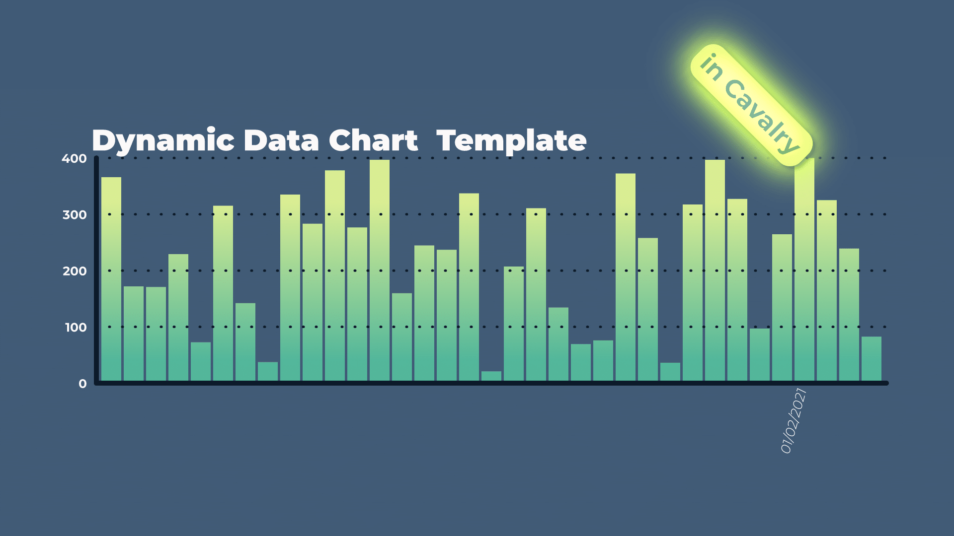
By changing Random modifier values and colour values in Color Array, you can get lots of variations of the same graphics with minimal effort. Once you set up everything with flexibility in mind, it is easy to render at an scale.
This project file contains all the assets necessary to make animation in the tutorial in final form. Everything is labeled, linked, with expressions and ready to use, if you wish to make your own version or just play around with it.
If you have any suggestions for tutorials or how I can improve, please do get in touch. I would love to hear from you.


