Proof of Concept lifestyle app
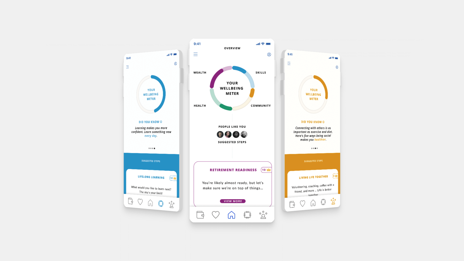
On this project, I have worked as part of small and agile team, consisting of Project Manager, Developer, UX Researcher, UI Designer, Web Developer and Motion Graphics Artist. We helped define an early stage prototype of a lifestyle app. This app would help you maximise your career and lifestyle potential, by using various metrics and suggestions, based on your inputs.
My role evolved with time as this project developed. Initially, I was tasked with creating a showcase pitch and demo video of the app. However, as scope changed, I jumped in to help the team with other jobs.
My final tasks included:
- Pitch animation video
- Pitch deck graphic design elements
- Polishing UI of the app
- Working on sign up and navigation UX of the app
- Creating clickable prototype in Figma
- UI of app website / landing page
Light, clean look
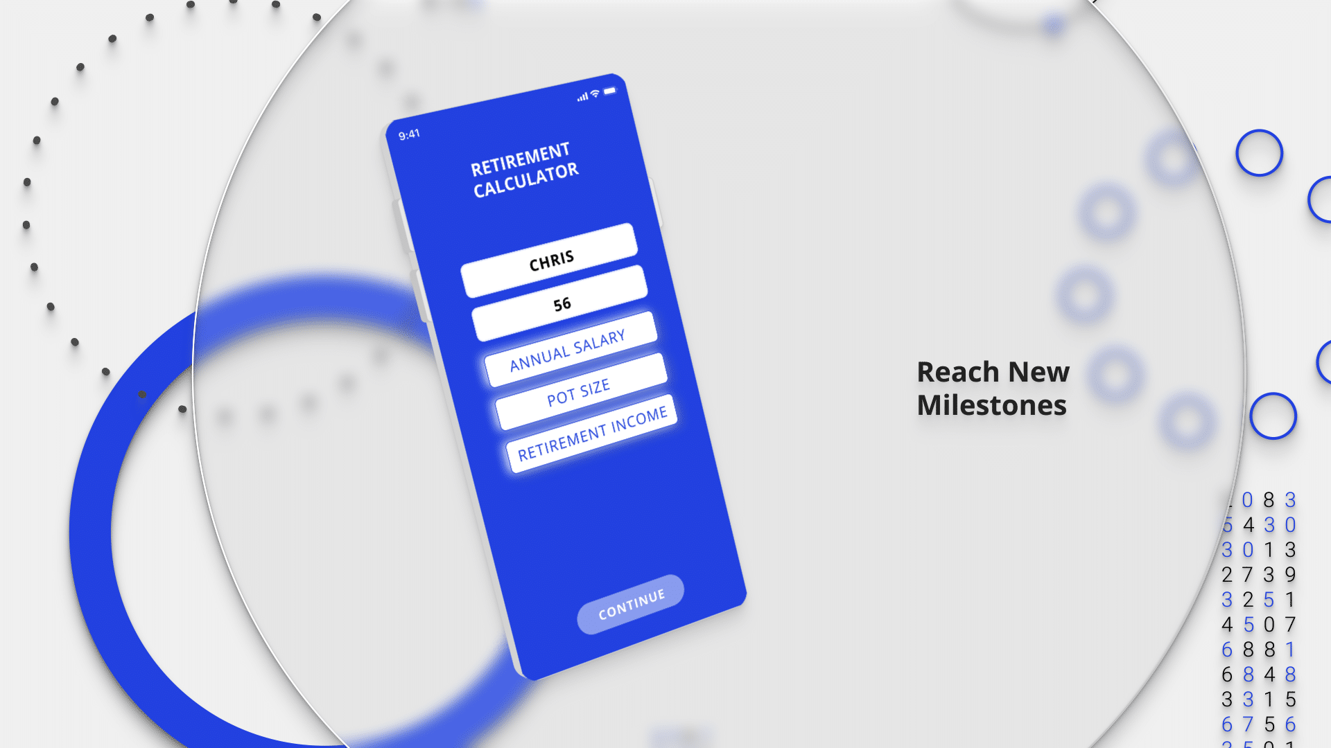
During brainstorm and discovery session, we have established a light and polished look for the visuals, both in app and in a pitch video. Inspiration came in from product demos we found on Pinterest and Dribble. Initially, we wanted to include various 3D elements in the design.
However, I had about 2 weeks to produce script and storyboard of the pitch video, design visuals, rig and create necessary elements and animate everything in time with audio. On top of the UI and UX work, that I was working on already.
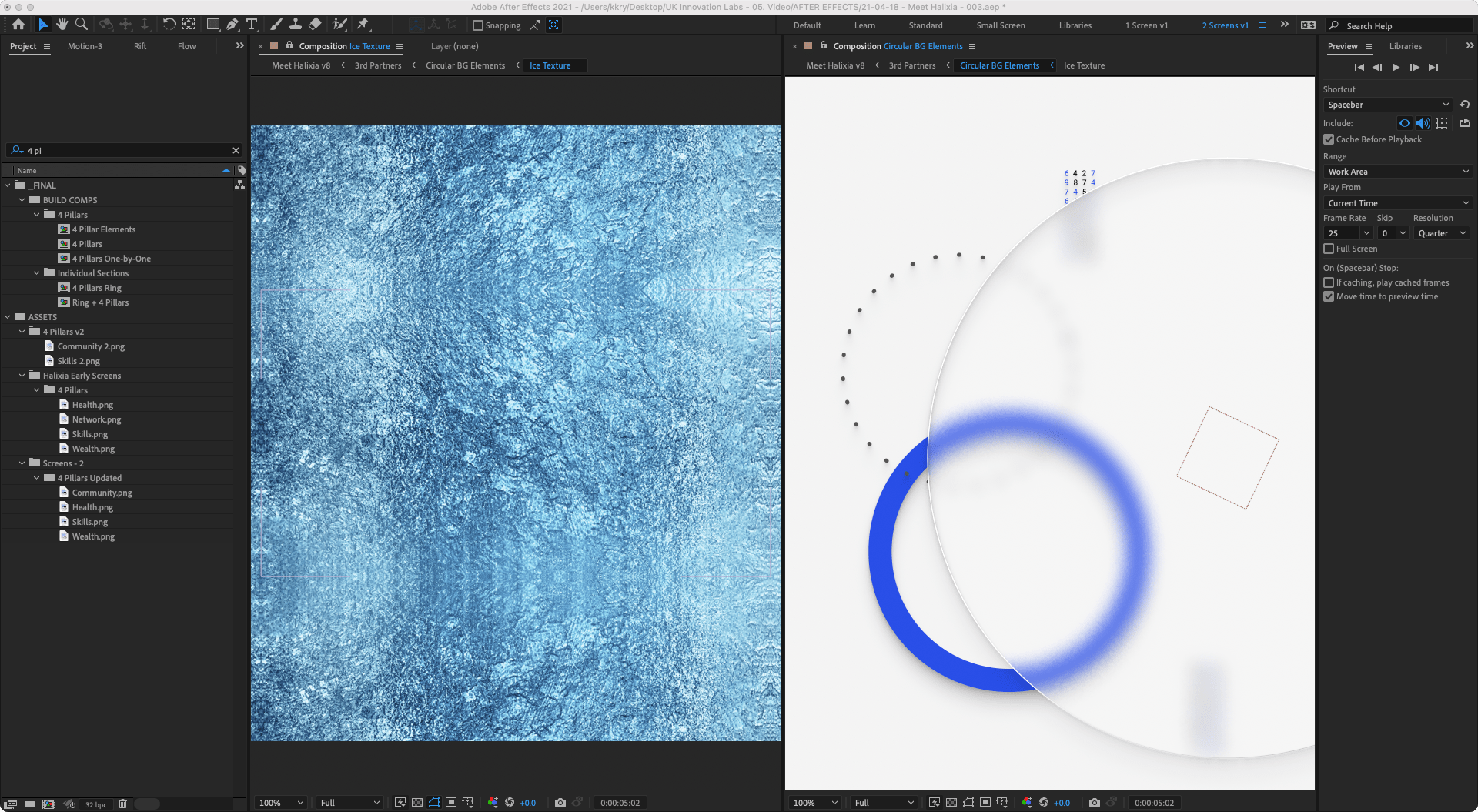
To solve the issue with short deadline, I opted out for mix of 2D, 2.5D and 3D animation. To help sell the “illusion”, I created an Ice Glass rig in After Effects, with a simple ice texture and some styling. This frozen glass element was used as a decorative piece throughout the video and in the pitch materials.


Subtle glass texture
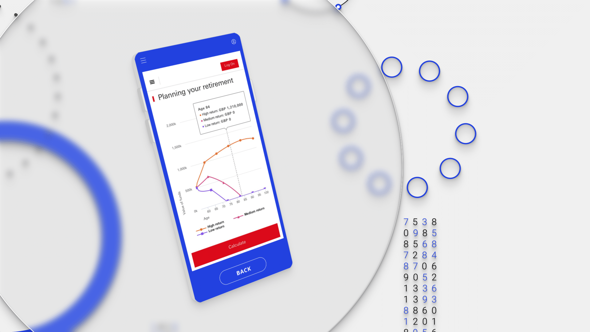
Ice Glass effect is subtle, adding small amount of details in the out of focus elements. It helps isolate main part of the image, app screens mock ups. You can see it better on the before and after images, in the blue ring area. It adds extra texture to edges of out of focus ring.
Creating this effect in After Effects, instead of in 3D software, help me keep the render time very fast and I was able to make tweaks to final design quickly, without waiting for photo realistic renders to finish in Blender.
4 Pillars
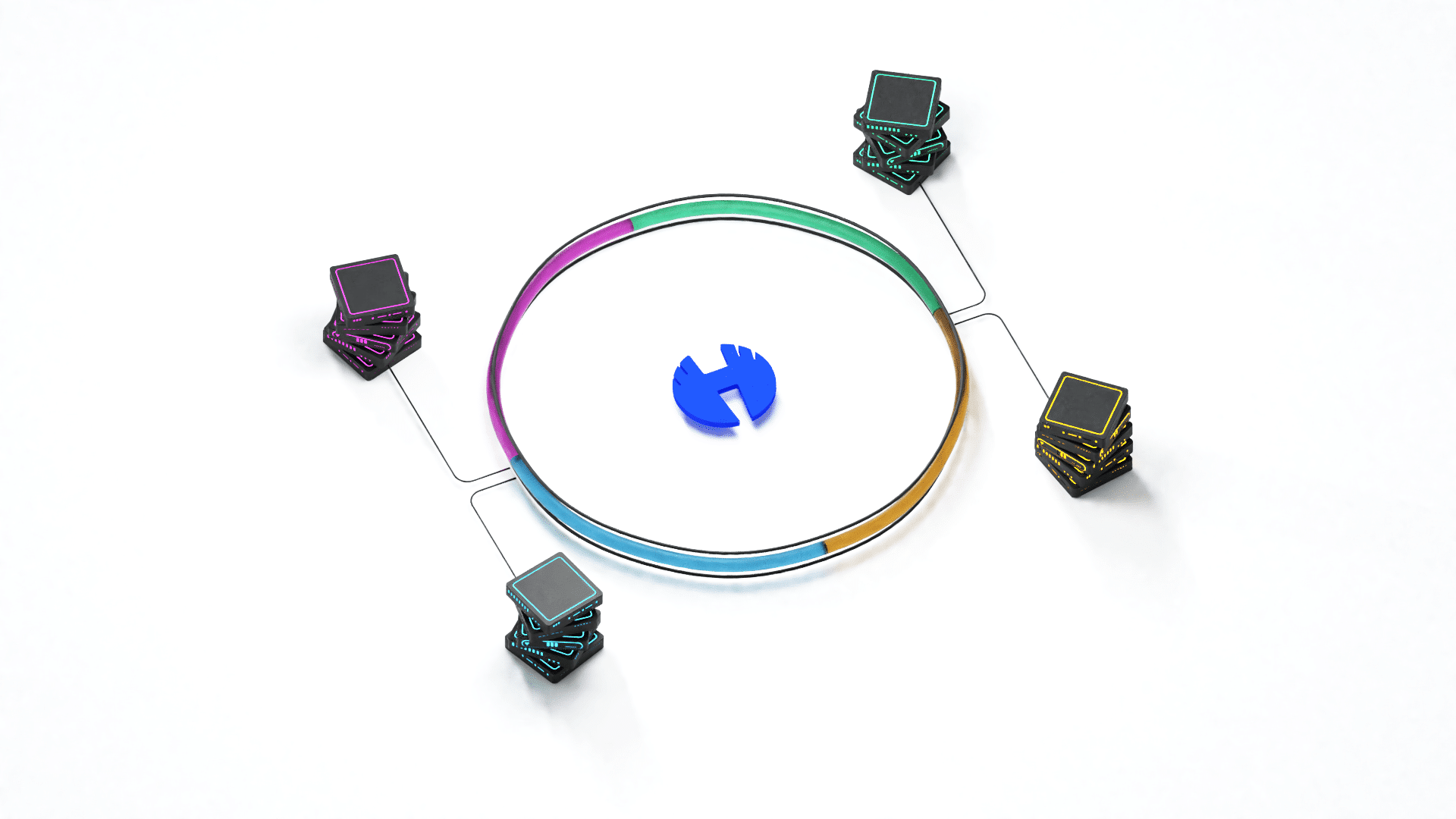
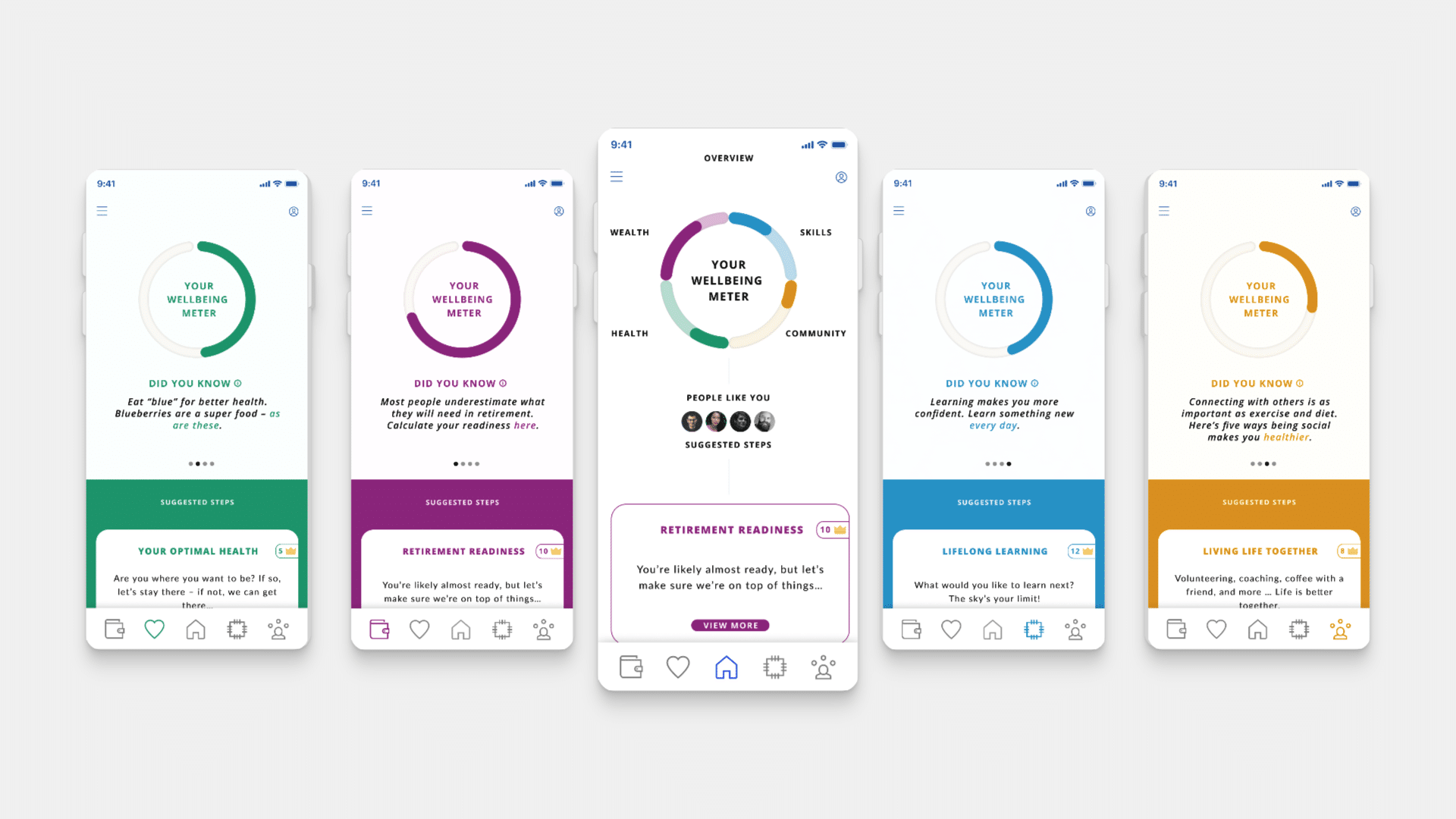
Whole app philosophy and direction is centered around 4 pillars:
- Wealth
- Health
- Skills
- Community
All of them are powered by proprietary code developed by in-house development team. To visualise this, I have created 3D illustration and animation of servers, that feed data into your Life Overview.
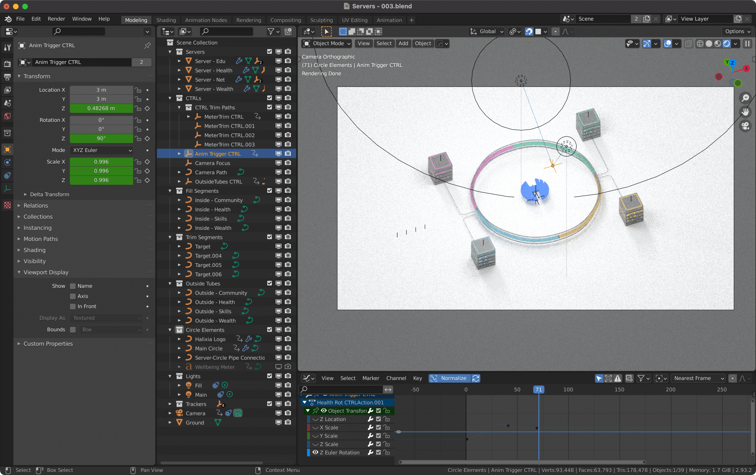
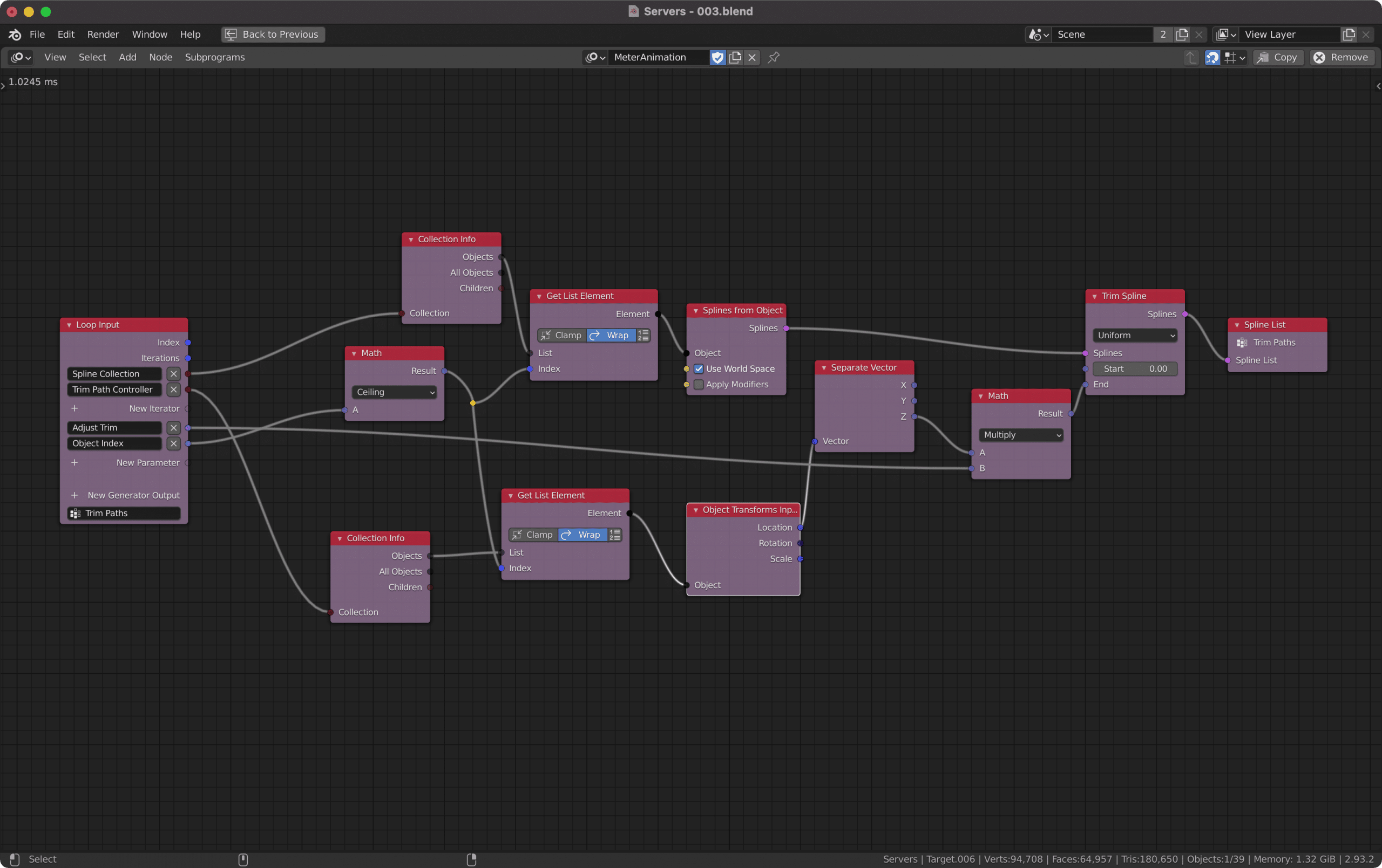
Whole illustration was done in Blender, using Animation Nodes. With a bit of Node based procedural animation, I was able to create “trim” effect to fill up glass tubes representing 4 pillars.
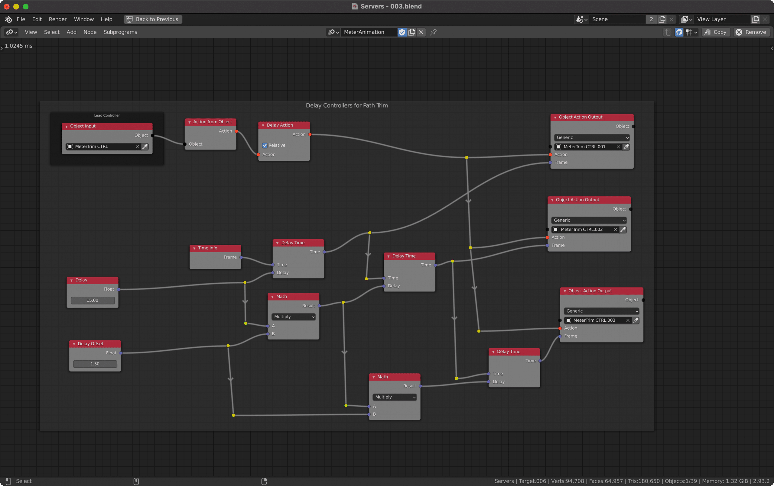
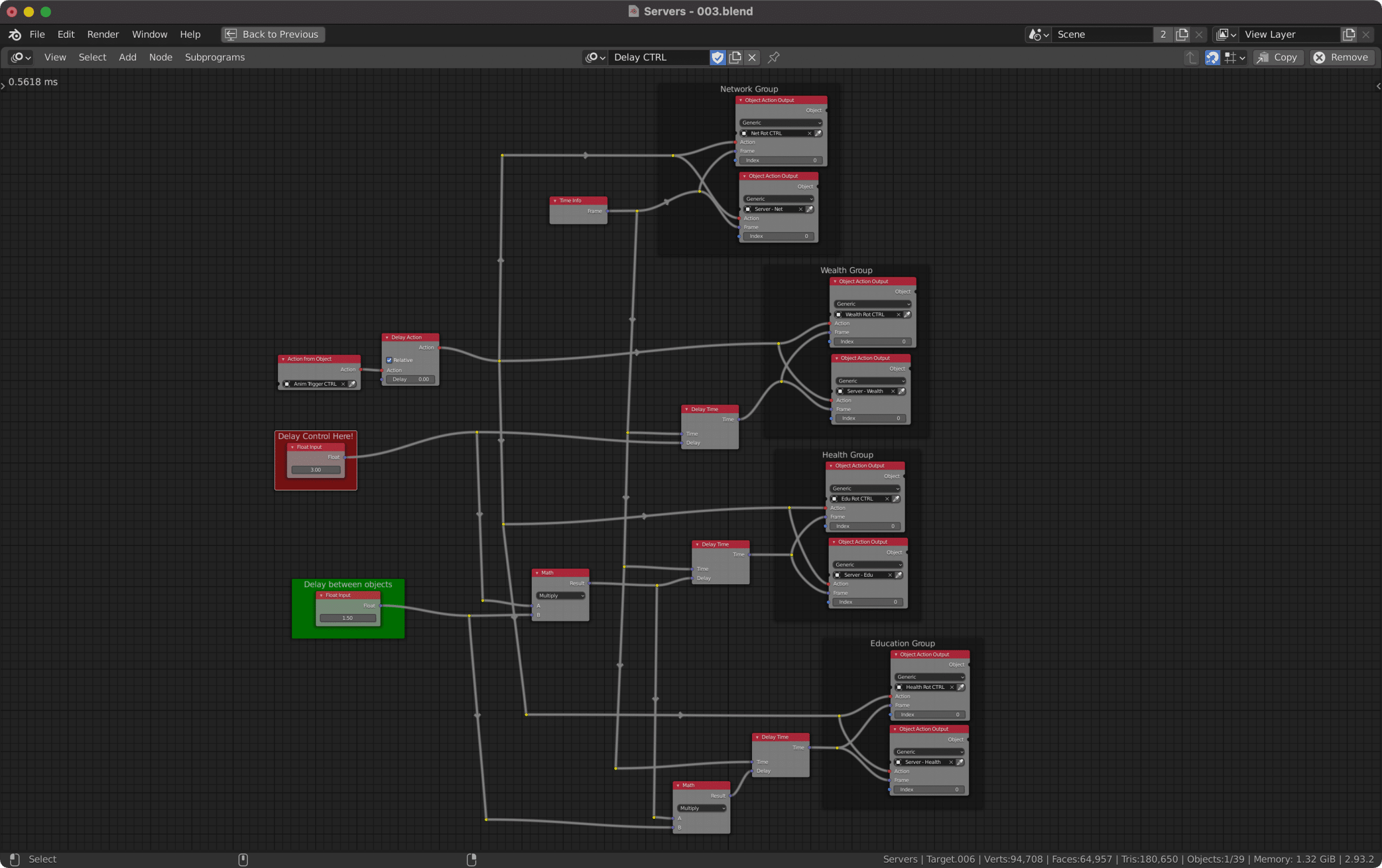
Additionally, server build up animation is driven by a single animated server. Then I duplicated animation with delay by using Nodes across 3 other servers. This way, I was able to tweak it and have the same motion apply across multiple objects with ease.
Behind the scenes Nodes set ups used to drive the animation. Looking back at it, I learned, that I could have used multiple “loop” groups. This would make managing multiple offsets and trim paths animation even easier.
2D to 2.5D to 3D
In final video, I have combined multiple elements into one story. I have used Figma prototype screen recordings, to showcase user journeys, 2D shape elements in After Effects, 2.5D set ups to add depth and movements and 3D elements from Blender. It was really fun and rewarding project to work on.
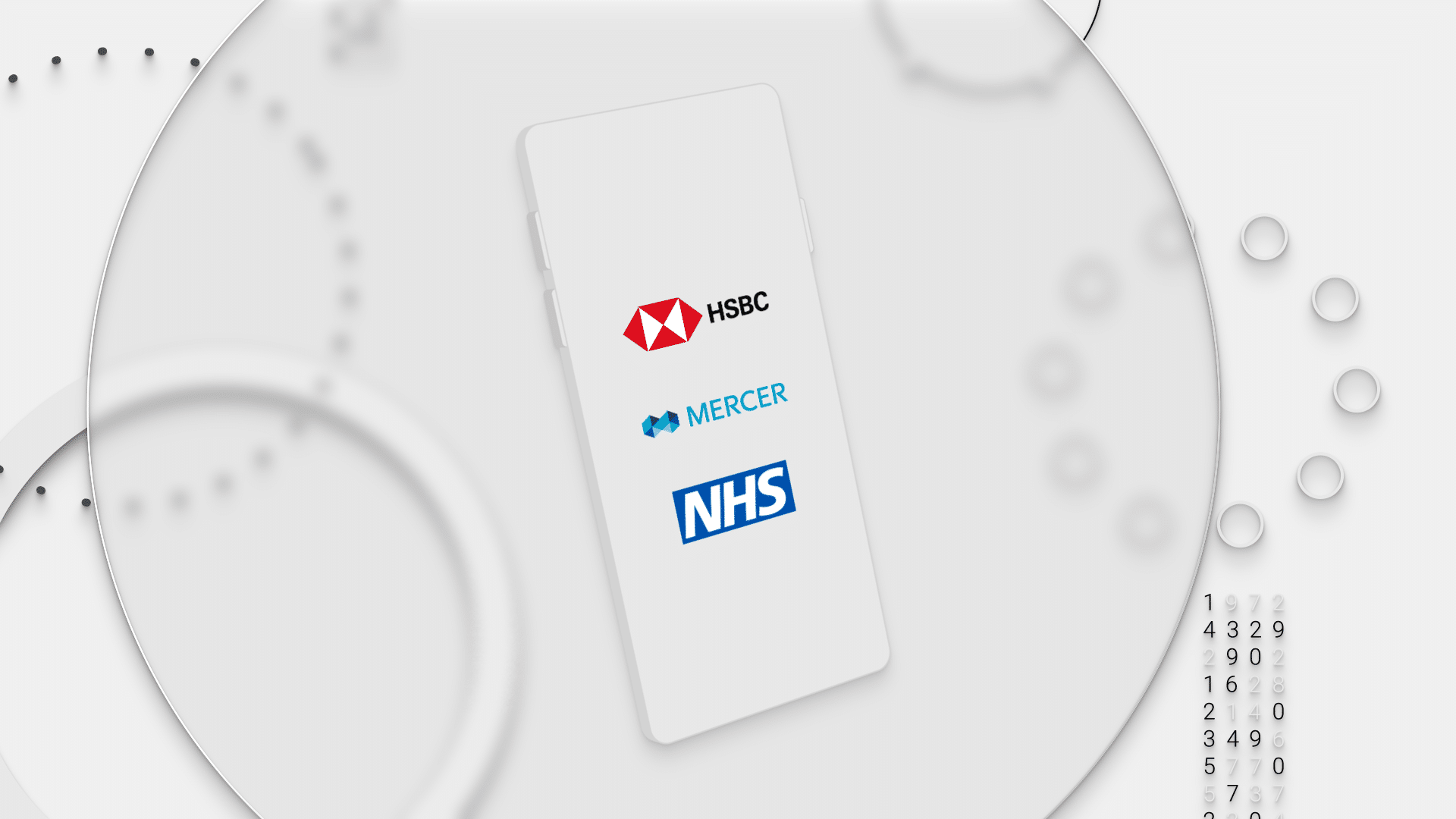
For phone illustration mock up, I ended up using shape layer extrusion in After Effects, to create a simple phone clay mock up. This let me keep the render time manageable and workflow less complex to update and iterate as per client requests.
Meet Halixia – Final Video
Project Stills
Here are some of the key scenes from final video in higher resolution.
Other Projects


